
See it framed
Hope Bainbridge Golden Pond
From $54.99
Beige & Cream Wall Art
Beige wall art is the design equivalent of a good white tee. It goes with everything, it never really dates, and it somehow makes the rest of the room look more expensive. If your home is already “white with beige” furniture, rugs, and linen floating around, beige art is the missing link that makes the space feel finished.

See it framed
Pictufy Studio Beach 3 Sets
From $164.99

See it framed
Hope Bainbridge When in Rome
From $54.99
Best seller

See it framed
John Fan Autumn Dreams
From $54.99
Best seller

See it framed
Dan Hobday Clay 3 Sets
From $164.99
Best seller

See it framed
Pictufy Studio Beach Vass 02
From $54.99
Best seller

See it framed
Dan Hobday Solthom
From $54.99
Best seller

See it framed
Bilge Paksoylu FA Vintage Floral 75
From $54.99

See it framed
Pictufy Studio Decided
From $54.99
Best seller

See it framed
Dan Hobday Gold Light
From $54.99
Best seller

See it framed
Pictufy Studio Ocean Serenity Path
From $54.99

See it framed
Dan Hobday 3:00 AM
From $54.99
New

See it framed
Ohkimiko Real Friends Bring Wine
From $54.99

See it framed
Dan Hobday Mountain View
From $68.99

See it framed
Raisa Zwart Beige Texture V
From $54.99

See it framed
Mareike Bohmer Coast Landscapes IV
From $54.99

See it framed
Hope Bainbridge Away We Go
From $54.99

See it framed
Hope Bainbridge Cambria
From $54.99

See it framed
Dan Hobday Estuary Dream
From $54.99

See it framed
Gemma Bardot Pieces of Me Collage
From $54.99
New

See it framed
Treechild Equine Embrace
From $54.99

See it framed
Kathrin Pienaar To the Sea
From $54.99

See it framed
Dan Hobday Le Surf
From $49.99

See it framed
Pictufy Studio Palm Leaves and Wall
From $54.99
Customer photos
In our customers’ homes
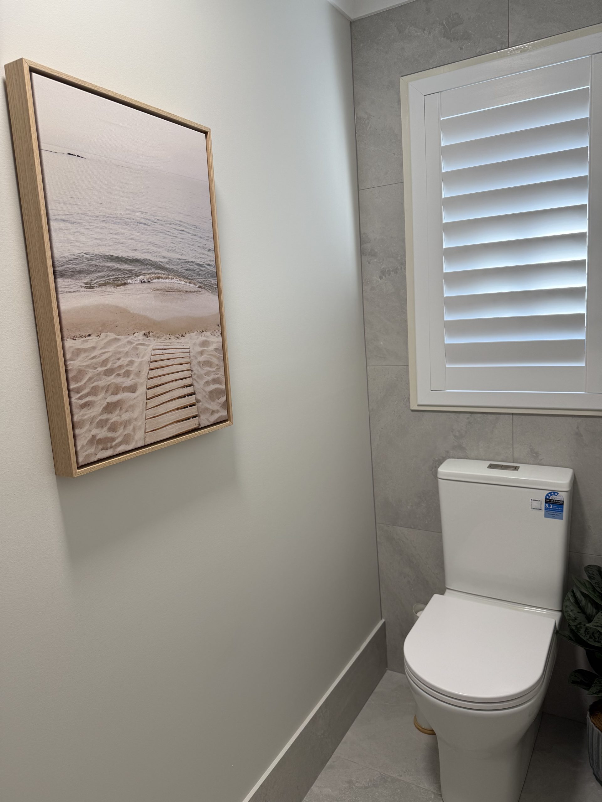
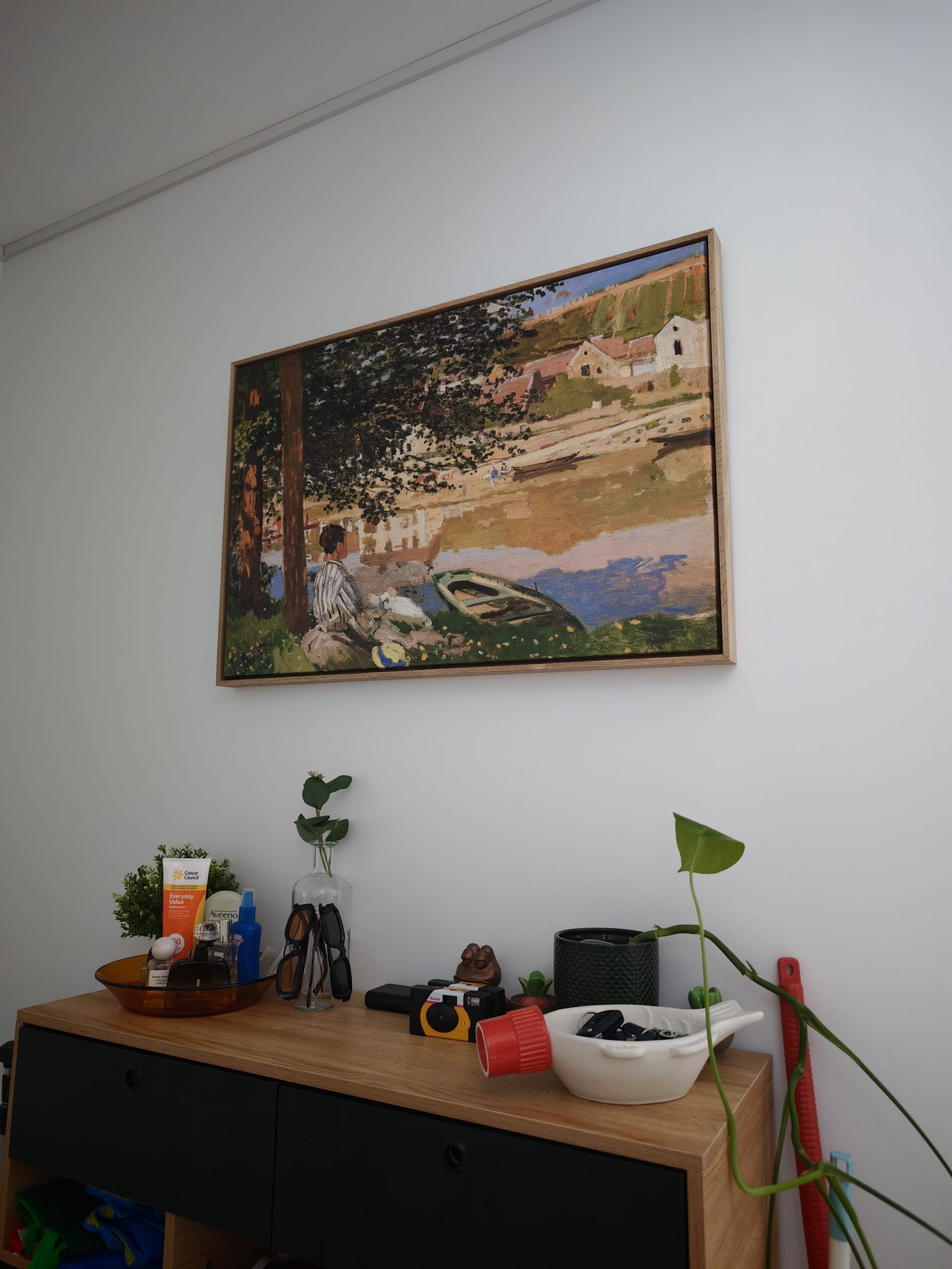


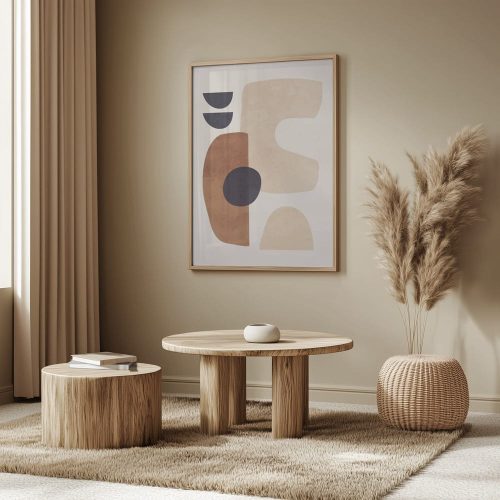


Buying guide
How to Choose Creamy & Beige Art
Size it to the furniture
Aim for art about two-thirds to three-quarters of the width of the sofa, bed or console beneath it. Smaller than half looks lost; a pair or trio fills the gap.
Hang it at eye level
Centre a single piece about 145 cm from the floor, or leave 15–25 cm between the furniture and the bottom of the frame.
Pick the frame for the room
Oak and white suit light, airy rooms; black sharpens contemporary spaces. Stretched canvas gives a frameless gallery edge.
Creating a Serene Sanctuary
If you’re chasing calm, beige wall art is basically the shortcut. It brings that quiet confidence into a room. The kind that makes you walk in and exhale.
It’s also one of the easiest ways to style a modern interior without committing to a loud colour story. Beige wall art plays nicely with changes over time too. New couch? New rug? Beige doesn’t get offended. It adapts.
At Wall Art Collective, every print is made to order in Australia, shipped free Australia wide, and crafted using quality materials and professional printing methods.
Minimalist & Abstract
Minimalist abstract art in beige is perfect if you like clean lines and a room that feels light, not busy. Look for neutral art prints with tonal layers, soft shapes, and a bit of negative space. Beige does its best work when it doesn’t have to compete with your sofa, your coffee table, or your “I swear I didn’t mean to buy another vase” collection.
Want a modern look without it feeling cold? Pair beige wall art with natural textures like linen curtains, boucle chairs, raw timber, and matte ceramics. A black frame adds structure. A white frame keeps it crisp. Timber adds warmth.
Textured plaster art is also having a very real moment. Those 3D looks, soft shadows, and imperfect surfaces make beige feel intentional, not bland. Like adding a pinch of salt to caramel. Small move, big difference.
Coastal & Hamptons Vibes
Beige is basically the unofficial colour of coastal decor and Hamptons styling. It works with white walls, timber floors, rattan, and soft blue accents without turning your home into a themed beach shop.
For this look, choose beige art with relaxed references. Dunes, hazy horizons, abstract waves, soft botanicals, or simple line art. These sit beautifully in living rooms and bedrooms where you want things to feel breezy and welcoming.
Tip: if your room already has a lot of texture, keep the artwork simpler. Let the tonal layers do the talking.
The Rise of Japandi and Wabi-Sabi
Japandi style is where Scandinavian simplicity meets Japanese warmth. Wabi-sabi leans into organic shapes, imperfect textures, and natural materials. Beige wall art fits both like it was invited.
This is where earth tones, clay shades, and subtle brushwork really shine. A minimalist abstract in sand hues. A quiet landscape. A textured print that feels calm, not clinical.
It’s also a great style match for well-known artists who use softer palettes and clean forms. If you like that “gallery, but make it liveable” feel, you might enjoy browsing our Claude Monet Art collection for pieces that sit beautifully in neutral spaces.
The Calming Bedroom
Your bedroom should feel like an exhale at the end of the day. Beige wall art helps you get there fast. Soft neutral art prints above the bed create a peaceful retreat without visual noise.
Go for gentle tonal layers, minimalist abstract shapes, or calm botanical prints. If your bedding is already cream, oatmeal, or warm white, choose artwork that’s slightly deeper so it doesn’t disappear into the background.
Canvas prints add texture and warmth. Paper prints feel crisp and refined, especially behind glass. Both work. It’s more about the mood you want when you walk in at night.
Sophisticated Living Rooms
Living rooms do a lot. They’re for guests, movie nights, working from the couch, and occasionally eating dinner “just this once” in front of the TV. Beige wall art works here because it’s versatile. It can calm a busy space, or add warmth to a minimalist one.
For bigger walls, large scale art looks intentional and designer-approved. One piece can anchor the whole room. If you prefer variety, gallery wall sets in soft neutrals can work too, especially with consistent frames.
Mid-century modern spaces suit warm beige palettes, abstract forms, and clean line art. Coastal spaces suit softer landscapes and sand hues. Contemporary rooms suit textured plaster art and modern neutrals.
If you want a shortcut, pick one anchor piece first, then style the room around it. It sounds backwards. It works.
Gender-Neutral Nurseries
Nursery wall art doesn’t have to be pastel rainbows or cartoon animals, unless you’re into that, in which case, go for it. Beige wall art is perfect for gender-neutral nurseries because it feels calm, soft, and timeless. It also grows with your child, which is handy because kids change their interests faster than you can say “why is there yoghurt on the wall?”
Choose warm cream tones, gentle shapes, and simple imagery. Keep it soothing. If you’re spreading costs with Paypal pay in 4 while you buy approximately one million baby items, that can make things easier too.
Hallways and “Awkward Spaces”
Hallways get ignored, then suddenly you notice they feel a bit bare. Beige wall art is brilliant here because it adds warmth without making the space feel smaller.
This is where narrow vertical art or long horizontal pieces earn their keep. Think narrow vertical art between doorways, or a slim landscape print along a long corridor. Landscape vs portrait orientation can change the feel of the space too. Portrait can add height. Landscape can add width.
If you’ve got a little nook, a small beige print can turn it from “why does this exist” into “oh, that’s nice”.
Choosing the Right Finish
Choosing between canvas prints and paper prints is less about “which is better” and more about what suits your space.
Framed poster prints are produced at 300 PPI on 250gsm satin photo paper. They have a smooth, polished finish and look beautiful in a frame behind high-clarity glass. If you love fine detail and a crisp look, this is a strong pick for neutral art prints.
Canvas prints are printed on 380gsm premium satin canvas and stretched over a durable timber frame. Many people love canvas because it has natural texture and feels a little more relaxed. Framed canvas prints are finished in a floating frame that adds depth and gives the piece a clean, elevated look.
If you’re styling a room with lots of soft materials, linen, timber, woven textures, canvas fits right in. If your space is clean and modern, paper prints with a simple frame feel sharp and refined.
The Longevity of Quality Printing
If you’re investing in beige wall art, you want it to last. That’s where quality materials and professional printing methods matter. Sharp detail, rich colour, and thoughtful finishing all help your cream tones and sand hues keep their warmth and clarity over time.
We also keep things easy on delivery. Pieces are made to order in Australia, packed with care, and shipped free Australia wide.
The “Two-Thirds” Rule for Sizing
This one is simple and it works. Aim for artwork that’s around two-thirds the width of the furniture below it.
Above a bedhead? Two-thirds of the bed width is a great starting point. Above a sofa? Same idea. It stops the art from looking like it’s floating awkwardly, and it makes the whole setup feel deliberate.
Large scale art is the quickest way to get that styled look in living rooms and bedrooms. Gallery wall sets work well too, especially when you keep the spacing neat and the frames consistent.
If you’re buying online, use your phone to take a photo of the wall, then measure the furniture width. It takes two minutes and saves a lot of second-guessing.
Matching Frames to Your Decor
Frames change the whole mood. Beige wall art can feel warm and organic, or crisp and modern, just by shifting the frame colour.
Natural timber, oak-style tones: Warm, relaxed, great for Japandi style and coastal decor.
White frames: Light and clean. Lovely for Hamptons styling and bright spaces.
Black frames: Adds contrast and structure. Perfect for minimalist abstract pieces and mid-century modern interiors.
If you’re building a calm palette from the ground up, our Neutral Art collection is a solid place to browse.
Investing in Quality
Beige wall art is timeless for a reason. It’s versatile, calming, and easy to style across modern homes. From minimalist abstract prints to textured plaster art looks, beige plays nicely with shifting trends and changing furniture.
If you’re buying art online, focus on quality materials, professional printing methods, and thoughtful finishing. At Wall Art Collective, every print is made to order in Australia, shipped free Australia wide, and crafted using fade-resistant inks and durable materials.
If your item arrives damaged, is defective, has a quality issue, or isn’t as described, please contact us as soon as possible after delivery so our team can review it. For faster assessment, requests should be submitted within 30 days of delivery where possible. Because artworks are custom made to order based on the size and options selected, we don’t accept returns or exchanges for change of mind, ordering the wrong size, or selecting the wrong options.
Ready to start browsing? If you want modern neutrals with soft shapes and tonal layers, our Abstract Art collection is a great next click. If you prefer clean, simple forms, you’ll probably love our Line Art collection.
Questions
Frequently Asked Questions
Still unsure? Our team replies within one business day.
How do I style beige art in a room with white walls?
Beige wall art is an easy way to lift white walls without making the room feel darker. Choose pieces with tonal layers, soft shadows, or 3D texture so the artwork has depth. A black frame adds contrast. Timber adds warmth. White frames keep it airy.
What is the difference between a fine art print and a canvas?
Framed poster prints are produced at 300 PPI on 250gsm satin photo paper and framed behind high-clarity glass for a crisp, polished finish. Canvas prints are printed on 380gsm premium satin canvas and stretched over a durable timber frame. Framed canvas prints are finished in a floating frame that adds depth and gives the piece a clean, elevated look.
How do I choose the right size for my wall?
Use the two-thirds rule. Aim for artwork that spans about two-thirds of the furniture width below it, like a bedhead or sofa. For hallways and narrow spots, narrow vertical art or a slim horizontal piece often looks the most intentional. Landscape vs portrait orientation can also change how spacious the area feels.
Is beige wall art suitable for bathrooms or kitchens?
Yes, beige wall art can work beautifully in bathrooms, kitchens, and laundries, especially if you like a calm modern interior feel. Choose quality materials and framing, and avoid placing prints where they’ll get hit with constant steam.
How do I match my frame colour to beige artwork?
For a warm, organic look, natural timber frames pair beautifully with cream tones and sand hues. For a crisp look, white frames keep things light. For contrast, black frames add structure, especially with minimalist abstract pieces.
Will my beige art prints fade over time?
Quality prints made using professional printing methods, fade-resistant inks, and quality materials are designed for lasting colour and clarity.
Can beige art work in a “busy” room?
Absolutely. Beige is a design anchor. It can balance bold furniture, patterned rugs, and colourful decor without fighting for attention. Neutral art prints give your eyes a place to rest while still making the space feel styled.
What lighting is best for showing off neutral artwork?
Neutral art looks best under layered lighting. Warm-spectrum bulbs bring out earth tones, sand hues, and cream tones. If you’re hanging textured plaster art or anything with 3D detail, angled lighting helps show the shadows and texture.
Filter
ColourChoose any
StyleChoose any
RoomChoose any
OrientationChoose any
Size availableChoose one
Single or setChoose any