
See it framed
ThingDesign Abstract Minimal Shapes 2 Sets
From $109.99
Brown Wall Art
Brown is one of those colours that just gets it right. Warm without being heavy, earthy without feeling dated. Our brown wall art collection spans everything from soft sand and caramel tones to rich chocolate and burnt sienna. Made to order in Perth, printed on premium materials, and ready to hang.

See it framed
Hope Bainbridge Alone in Solitude
From $54.99

See it framed
Dan Hobday Cooking
From $54.99
Best seller

See it framed
Shot by Clint Gentle Equine Gaze
From $54.99
Best seller

See it framed
Dan Hobday Solthom
From $54.99

See it framed
Treechild Golden Blossom Glow
From $54.99

See it framed
Hope Bainbridge The Depths
From $68.99

See it framed
Dan Hobday Emerging
From $54.99

See it framed
Hope Bainbridge Continental 2 Sets
From $109.99

See it framed
Hope Bainbridge East Side
From $68.99

See it framed
Kathrin Pienaar Blue Brown Blocks
From $54.99

See it framed
Hope Bainbridge Summer Vibes 2 Sets
From $109.99
New

See it framed
Treechild Doe in Wildflowers
From $54.99

See it framed
Hope Bainbridge Ink Blots
From $54.99

See it framed
Anyone Can Yeehaw Daphne the Cowgirl Duckling
From $54.99

See it framed
Orara Studio Mid Century Brown 2 Sets
From $109.99

See it framed
Pictufy Studio Pathway to Serenity
From $54.99

See it framed
Hope Bainbridge Magical Forest 3 Sets
From $164.99

See it framed
Orara Studio Mid Century Brown 3 Sets
From $164.99

See it framed
Hope Bainbridge Yesterday's Wishes 2 Sets
From $109.99
New

See it framed
Sally Ann Moss Serene Rolling Hills
From $54.99

See it framed
Shot by Clint Abstract Beauty of Spiky Plant
From $54.99

See it framed
Hope Bainbridge Berlin
From $54.99
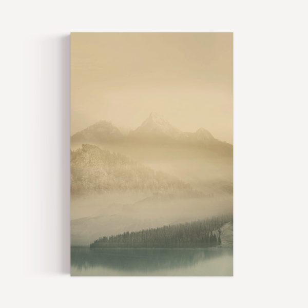
See it framed
Hope Bainbridge Awakening I
From $54.99
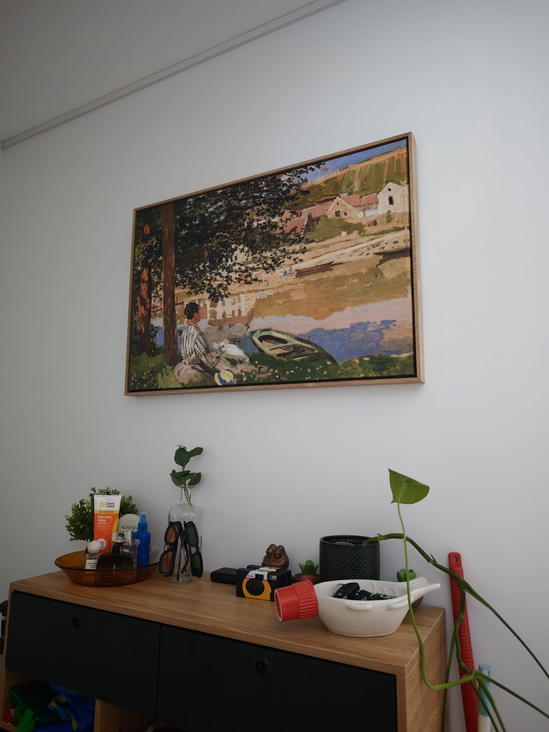
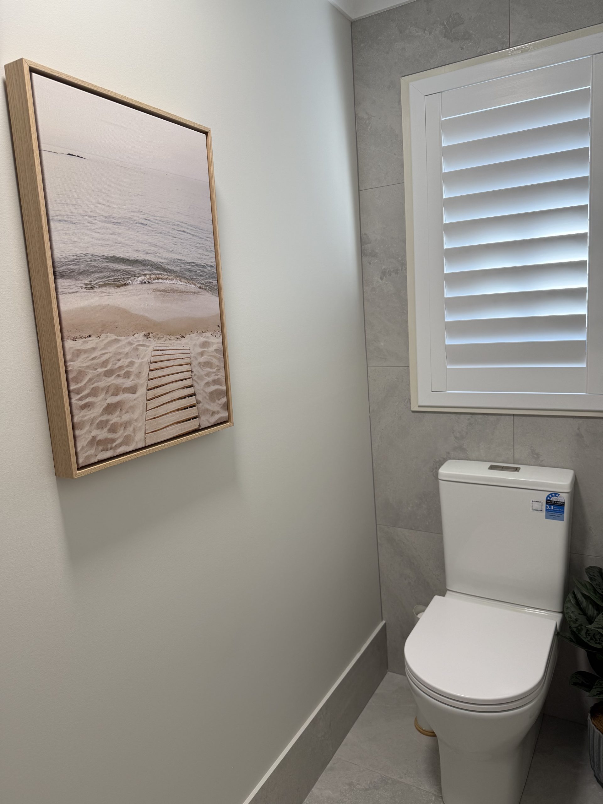
Customer photos
In our customers’ homes



Explore related collections


Buying guide
How to Choose Brown Art
Size it to the furniture
Aim for art about two-thirds to three-quarters of the width of the sofa, bed or console beneath it. Smaller than half looks lost; a pair or trio fills the gap.
Hang it at eye level
Centre a single piece about 145 cm from the floor, or leave 15–25 cm between the furniture and the bottom of the frame.
Pick the frame for the room
Oak and white suit light, airy rooms; black sharpens contemporary spaces. Stretched canvas gives a frameless gallery edge.
Popular Styles in This Collection
Brown art covers a lot of ground. Abstract prints in ochre, umber, and terracotta are a popular starting point, especially for living rooms and open-plan spaces. Botanical and floral prints in sepia and warm neutral tones work beautifully in bedrooms and bathrooms. For something more distinctly Australian, our landscape prints lean heavily into ochre reds, sandy beiges, and bush tones that feel right at home on Australian walls.
Where Brown Art Works Best
Earthy tones suit almost any room. In the living room, brown art pairs naturally with timber furniture, rattan, and linen. In the bedroom, lighter caramel and sand tones keep things calm and restful. In a home office, deeper espresso hues add a sense of focus and warmth. Brown also works well in Hamptons-style interiors, adding warmth to blue-and-white palettes that can sometimes feel a little cool on their own.
For colour pairing, teal, mustard, and burnt orange all complement earthy tones well.
Choosing the Right Style and Format
Our brown art is available as stretched canvas, framed canvas, and framed poster prints.
Stretched canvas suits a relaxed, gallery-style look with no framing required. Framed prints are finished in FSC-certified solid timber frames in oak, black, or white. For warm earthy tones, oak is a natural match. White frames work well with lighter sand and beige prints. Black suits more graphic or high-contrast pieces.
If you’re building a gallery wall, consider mixing brown art with neutral or creamy beige prints for a layered, considered look.
Caring for Your Art
Our prints use fade-resistant inks, but it’s worth keeping art out of direct harsh sunlight where possible, particularly in rooms with strong afternoon sun. For canvas, a soft dry cloth is all you need to remove dust. Framed prints behind glass can be wiped down with a clean, lightly dampened cloth on the glass surface. Avoid moisture near the frame edges.
Buying With Confidence
All pieces are made to order in Perth and arrive ready to hang. Free shipping Australia-wide. PayPal Pay in 4 available. If your order arrives damaged or with a manufacturing defect, get in touch and we’ll sort it out.
Questions
Frequently Asked Questions
Still unsure? Our team replies within one business day.
What colours go best with brown wall art in a living room?
Warm neutrals like beige, cream, and tan are the easy pairing. If you want to add more depth to the room, accent colours like teal, mustard, and burnt orange work really well. They add energy without clashing with the earthy base.
Is brown wall art too dark for a small room?
Not at all. If you’re working with a smaller space, look for pieces in lighter brown tones like sand, warm beige, or caramel. These shades add depth and warmth without making the room feel smaller. Pair with light furniture and good natural light and you’re set.
How do I choose the right frame for brown art?
Oak frames are the natural match for warm earthy tones. If your space is more modern or you want a crisper look, white frames provide a clean contrast. Black frames work well when you want something more graphic and structured.
Can I pair brown art with black and white decor?
Absolutely. Brown art is brilliant for softening the contrast in a black and white room. It adds warmth and creates a more layered, inviting feel. Think of it as the missing element that makes a monochrome room feel less stark.
What is the difference between brown and neutral wall art?
Brown art tends to feature warmer, richer tones like chocolate, sienna, and umber. Neutral art typically leans toward lighter creams, oatmeal, and soft greys. They’re highly complementary and mix beautifully together in a gallery wall or styled shelf.
What size art should I hang above a sofa?
A good rule of thumb is to choose a piece that spans roughly two thirds the width of your sofa. That proportion keeps the room feeling balanced and prevents the art from looking lost on the wall. If you’re after something with real presence, have a look at our extra large art range.
How do I brighten a room that has lots of brown decor?
Introduce lighter-coloured furniture, rugs, or cushions to lift the palette. Mirrors are great for bouncing light around, and maximising natural light always helps. If you want to brighten the art itself, consider pieces with warm sandy or cream backgrounds. Our gold and yellow art collection has some beautiful options that pair well with earthy tones.
Filter
ColourChoose any
StyleChoose any
RoomChoose any
OrientationChoose any
Size availableChoose one
Single or setChoose any